Compatibility:
WebSite X5 Pro
Creating an online store, especially when managing a large number of products, can be quite challenging. To save you time while ensuring you get sales-optimized pages, WebSite X5 can automatically create both product presentation cards and full Product Pages complete with all the necessary information.
In this guide, we will focus on the cards: we’ll look at when they are used, how they are generated, and how you can customize their composition and graphic style.
- What are product cards
- When they are created
- How they are composed
- What information they contain
- How to customize them
- How to apply ribbons
- How to manage the links
What are product cards
A card is simply a box where basic information about a product is summarized, and in most cases, a purchase button is made available. They are the equivalent of a business card, and a web page can contain many of them.
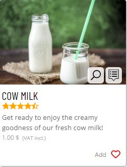
They serve to briefly introduce products to customers, allowing them to get an idea of what might interest them and then decide which offers to focus their attention on.
When they are created
Article cards are automatically created by the software when using:
- The Product Catalog Object, useful for presenting only a selected group of products from the catalog on a page;
- The Product Search Page, useful for allowing customers to search through categories and filters within the entire product catalog;
- The Wishlist Page, useful for allowing customers to add products to a wishlist to postpone their purchase for later.
In all these cases, the selected products are displayed through dedicated cards.
Come sono composte
The cards are composed of the following elements:
- Background: A colored or transparent background to which a border can be applied.
- Cover: The image set as the product cover.
- Contents: The textual part of the card, which includes all the following elements
- Title
- Description
- Details
- Price
- "Add to cart" button
- "Add to wishlist" button
You can, of course, intervene on the composition of the cards and decide that one or more of these elements are not included:
- Open the settings window (you can do this by selecting the inserted Product Catalog Object, the Product Search Page or the Wishlist page and clicking the Edit button) and, if necessary, go to the Settings section.
- Use the dropdown menu in Card Style to select the element you want to modify.
- Click to check or uncheck the Visible option to ensure that the specified element is present or not within the cards.
- In the specific case of Details, you can decide which information to make available in the cards in a detailed manner.
#tip - Even though the cards are designed for e-commerce, you can ensure they don't include the price or the 'Buy' button. This way, you can still use the cards if you just want to showcase your products without offering them for sale.
What information they contain
To create the cards, WebSite X5 primarily uses the information entered through the Article Settings window accessed when adding a new article or modifying an existing one (Step 1 - Settings > Shopping Cart > Products).
Specifically, the cards report the following elements:
- As Cover, the first image inserted in the Image section;
- As Title, the name given to the product in the General section;
- As Description, the brief description also inserted in the General section;
- For Details:
- the category is the one in which the product is eventually included in the catalog;
- the rating (displayed as stars) is shown only if the collection of Comments and Ratings has been enabled through the settings of the special page E-commerce: Product Page;
- the variants are taken from the Options section;
- Availability reflects what is set in the Availability section;
- As Price, the one indicated in the General section.
Of course, if a piece of information is not specified through the Product Settings window, it will not be included in the card.
How to customize them
As mentioned, the cards are automatically created by WebSite X5 using the information entered about the products. By default, the appearance of the cards is determined by the Template you have chosen for the site, but you can customize it.
- Open the settings window (you can do this by selecting the Products Catalog Object, the Products Search page, or the Wishlist page, and in all cases, clicking on the Edit button) and go to the Settings section.
- Start by defining how you want the cards to be arranged within the page. Use the Arrangement option to choose between:
- Fixed Height: the cards are arranged in a grid. Since all cards have the same height, the grid appears regular and compact.
- Variable Height: the cards are still arranged in a grid, but the height of each varies according to the proportions of the image used as the Cover. The cards may not completely occupy the grid cells in which they are placed, leaving empty space between them. This arrangement is particularly suitable when deciding to display a single card per row or when planning to display on a single row divided into multiple columns.
- Masonry: in this case, the height of the cards varies according to the proportions of the Cover image. The difference from the previous arrangement is that the cards are not arranged in a regular grid but aligned in multiple rows and columns without leaving spaces to compensate for the smaller sizes of some of them.
- SlideShow: (available only for the Products Catalog Object) the cards have equal height and are displayed in a single row within a slideshow, complete with navigation buttons.
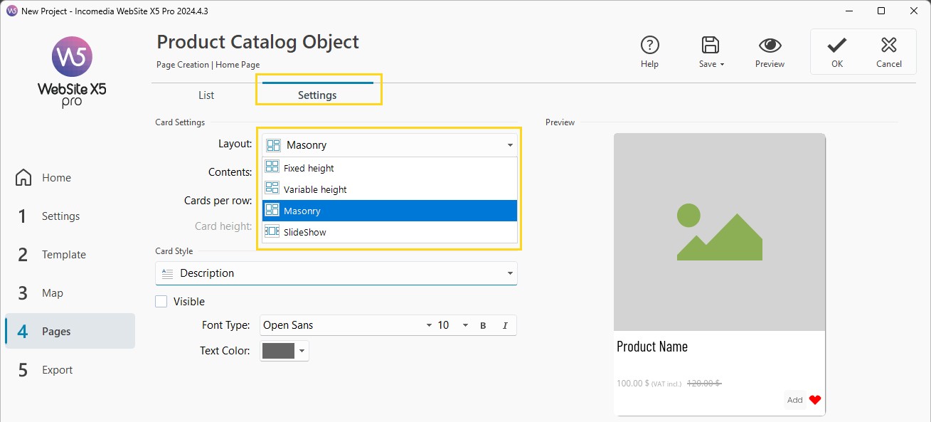
- At this point, you can decide how the different elements within the cards should be arranged. Use the Contentsoption to choose between:
- Cover on the left, title and content on the right;
- Title and content on the left, cover on the right;
- Cover at the top, title and content below;
- Title and content at the top, cover below;
- Cover as background.
- In general, you can also define the number of Cards per row and the maximum number of Rows per page. If the expected number of products exceeds this, pagination will be introduced.
- If you wish, modify the Height of the cards. Keep in mind that based on this parameter, the images associated with the products will be resized. Regarding the texts, if they are too long, a scrollbar will be displayed.
- To enhance the appearance of the page, you can also adjust the Margins between the cards.
- Finally, you can address the elements that make up the cards: use the menu in Card Style to select the element you want to act on. Based on the selected element, you can use different options, such as color, font, margins, and effects.
How to apply ribbons
If you have new products or discounted products, you can highlight them by placing a badge on their cards.
First, you must have already defined which products are new or discounted:
- In the catalog creation phase (at Step 1 - Settings > Shopping cart > Products), create a new product or modify an existing one to access the Product Settings window.
- For a product to be considered "new": stay in the General section and activate the option Highlight the Product as 'New'.
- For a product to be considered "discounted": go to the Discount section and apply a fixed or percentage discount (see: How to set a discount on a single product)
Once the products are set, you can return to work on the cards:
- Open the settings window (you can do this by selecting the Products Catalog Object, the Products Search page, or the Wishlist page, and in all cases, clicking on the Edit button) and go to the Settings section.
- In the Ribbons section, choose the Type of Ribbon you want to apply: New Product or Discounted Product.
- Choose the image you like best for the badge: you can use one of the proposed ones or import the Image File you prefer.
- Finally, define the Alignment and the Width of the badge relative to the card.
How to configure the purchase and Wishlist buttons
The buttons on Product Cards allow customers to add a product to their cart or save it to their Wishlist.
In the Settings section, use the Card Style menu to select the button you want to configure:
- Add to cart: use Visible to choose whether to display it, and customize its appearance with the available options. Enable Add without displaying the Shopping Cart if you want customers to continue browsing the page after adding a product.
- Add to wishlist: choose whether to display it and define its appearance. Enable Add without displaying the Wishlist to let customers save an item while continuing to browse the page.
Choose the behavior that suits the shopping experience you want to offer. For example, adding products without opening the Shopping Cart can be useful when customers need to select several items from the same list.
How to open the image gallery from a Product Card
The Cover displays the product’s first image. You can allow customers to open a gallery to view the other available content.
- Go to Step 1 - Settings > Shopping Cart > Products.
- Open Product Settings > Image and add the images you want to use.
- Return to the Settings of the Object or Special Page displaying the Product Cards.
- Enable Enable image display in ShowBox.
When customers hover over the Cover, a button with a magnifying glass appears. Clicking it opens the gallery in ShowBox.
#tip – EU GARAN label. For products with a configured commercial guarantee of durability, the gallery opened from the Product Card also includes the full EU GARAN label, no later than the third position. You do not need to add it as a custom ribbon. To learn about the requirements and configure the details, see EU GARAN label. How to display the commercial guarantee of durability in your online store?
How to link a Product Card to its Product Page
If you want to provide a more detailed presentation, you can link the Product Card to the item’s dedicated page.
- Go to Step 1 - Settings > Shopping Cart > Products.
- Select the item and open Product Settings > Details.
- Enable the creation of the corresponding Product Page.
- Complete the page content and confirm.
When the Product Page is available, a button for opening it appears when customers hover over the Card’s Cover. The Card’s Title also links to the page.
#tip – To enable dedicated product pages, see What is the Product Page and how do you use it?
Practical tips
Before publishing your store:
- check the Product Cards wherever you use them: Product Catalog Objects, Product Search, and Wishlist;
- check that names and descriptions make it easy to distinguish between items;
- choose Cover images with consistent proportions and quality, especially if you use a regular grid;
- check that text and prices are readable and that ribbons do not cover the product;
- test the purchase and Wishlist buttons and the links to Product Pages;
- open the galleries and check the order of their content;
- check the result at different window widths and, after publishing, on a smartphone too.