Compatibility:
WebSite X5 Evo and Pro
When you need to present multiple services, products, benefits or categories, organizing your content into boxes is one of the most effective and widely used web design solutions. Each element is clearly separated from the others, easy to read and can guide users toward a specific action thanks to a dedicated button.
With the Box List Grid Optional Object, you can create a grid of boxes containing an image, title, text and button in just a few steps, while maintaining a consistent style and letting the program automatically adapt the layout to different screen sizes.
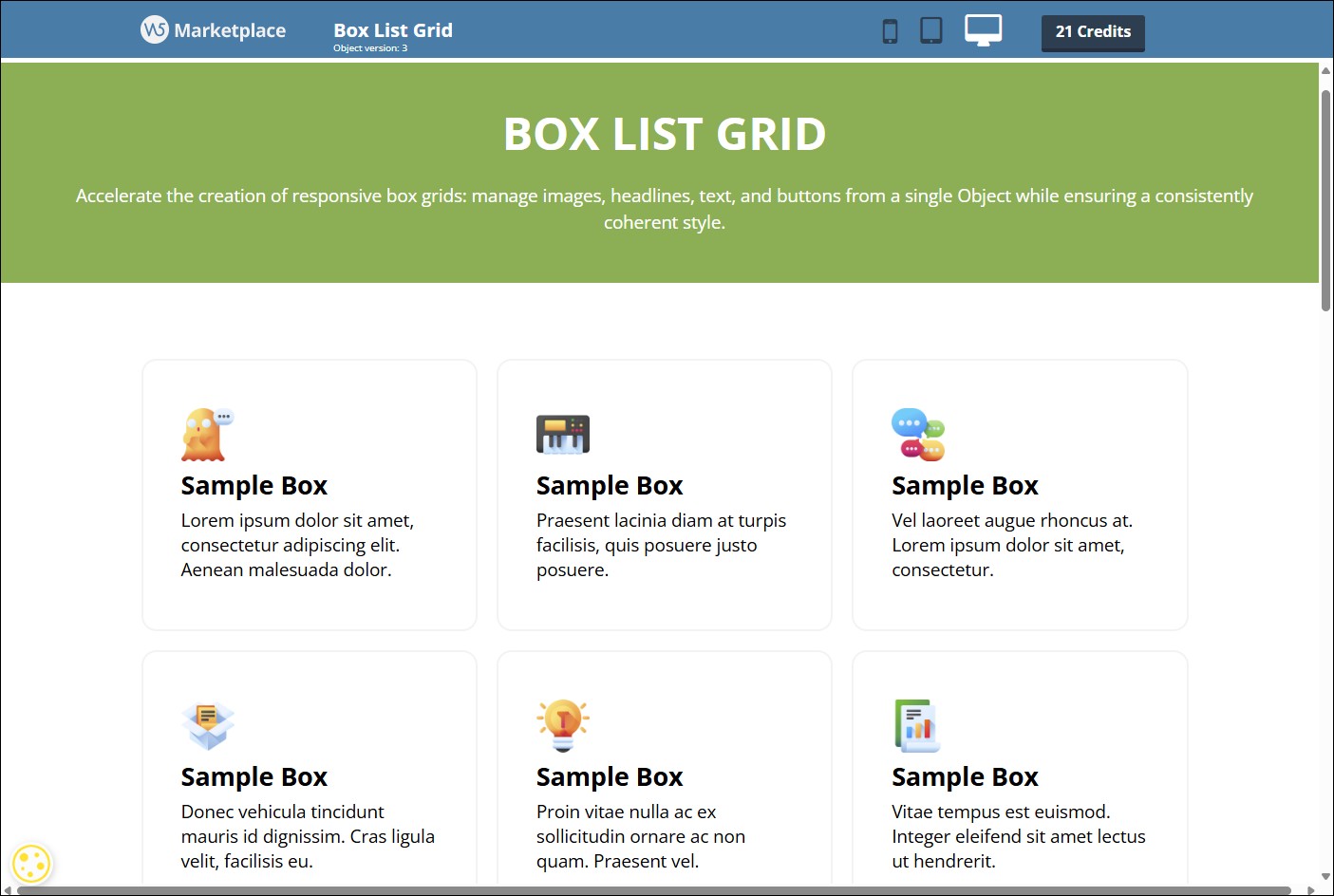
Take a look at some examples of what you can create on the Preview page.
When to use Box List Grid
The Box List Grid Object is especially suitable when you need to present a collection of content items that share the same visual structure.
Collections of boxes (or cards) are now one of the most popular solutions in web design because they organize information in a clear, tidy and easy-to-read way. Each element is clearly separated and can highlight a service, product, feature or link.
For example, you can use Box List Grid to create:
- service lists;
- product or category grids;
- collections of benefits or features;
- steps in a process or journey;
- packages or pricing plans;
- links to the main sections of your website.
Each box can include an image or icon, a title, descriptive text and a button with a link, providing a clear, consistent and easy-to-understand presentation.
How to add content
To create your grid, you first need to define the individual boxes it contains.
- Double-click the Box List Grid Object inserted on the page to open the window containing all its options.
- Stay in the Content section and click the Add button to insert a new box into the list.
- Select the newly created box and enter all the required information. Each box can include:
- a Title;
- Text, which provides the box description;
- an Image or icon. You can choose one from your local PC library
 or from the
  Online Libraries and make it
  accessible by adding Alternative Text (see Image accessibility: the importance of alternative text);
 - a Button by entering its text label (its style will be defined in the Style section);
- a Link, available when a button is present. Click
 to open the Link window and choose the action to perform when it is clicked.
- Repeat these steps to create all the boxes you need.
- To edit the list of boxes, select the one you want to change and use the Remove button to delete it or the arrow buttons to change its position.
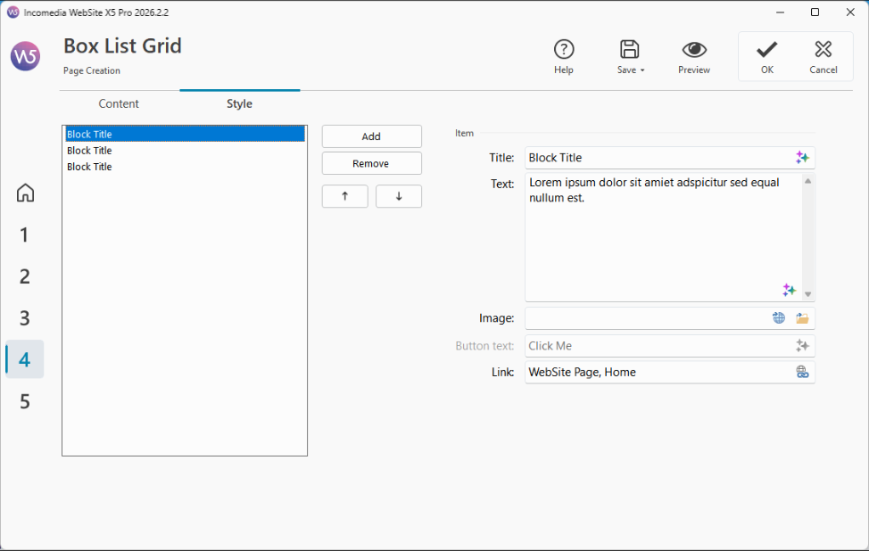
#tip – You can use MagicText, the AI assistant built into WebSite X5, to write or edit titles, texts and button labels.
How to customize the appearance
After adding the content, you can customize the appearance of the Object so that it perfectly matches your website design.
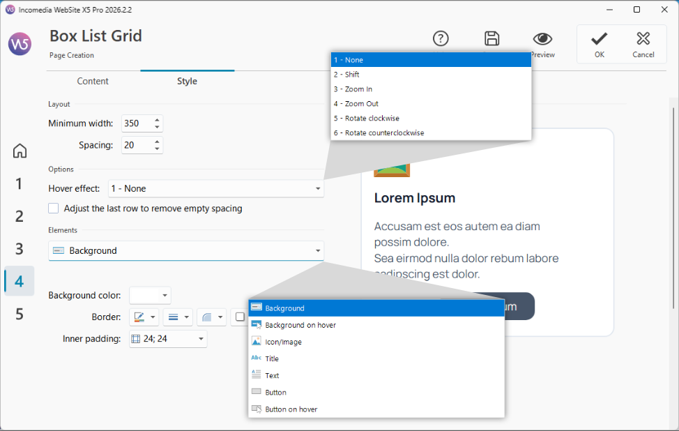
- Open the Style section.
- Set the minimum Width that the boxes can have and the Spacing to be maintained between them. These parameters determine the size and arrangement of the boxes according to the available space.
- Choose which Hover effect to apply to the boxes.
- If the number of boxes is not enough to completely fill the last row of the grid, enable the Stretch last row to remove empty spaces option so that the boxes still occupy the entire available width.
- Now select the Element you want to customize: Background, Hover Background, Icon/Image, Title, Text, Button, or Hover Button.
- Use the available options for the selected element to define colors, borders, fonts, margins, spacing, alignment and visual effects.
- Once you are satisfied with the result, click OK to confirm.
Why use a single Object to create multiple boxes?
Even without Box List Grid, you can achieve the same result by manually building each box using other Objects. However, in that case every element must be created, configured and updated individually.
With Box List Grid, instead, you can manage an entire collection of boxes from a single configuration window, making your work much faster and more organized.
This approach offers several advantages:
- it reduces the time needed to create even very large grids;
- it ensures a consistent style across all boxes;
- it makes editing and updating content easier;
- it eliminates the need to repeat the same operations for every single element.
How it adapts to different devices
One of the main advantages of Box List Grid is its automatic responsive layout management.
On large screens, the Object automatically displays multiple boxes side by side. When the available space decreases—for example because the Object is placed inside a narrow column or because the page is viewed on a tablet or smartphone—the layout is progressively rearranged.
The result is a layout that remains clear and easy to read, without requiring you to create different versions of the same content or manually adjust the arrangement of the elements.
Ready to use it?
Would you like to present services, products or benefits in a neat, consistent and fully responsive grid of boxes? Install the Box List Grid Object now.
Don't have enough Credits to purchase this Object? View all Credit packages.