Compatibility:
WebSite X5 Evo and Pro
When working with image collections or visual content, it is often necessary to manage elements of different sizes without giving up an orderly and visually pleasing layout. Forcing all images into a rigid grid, however, is not always the best choice and can compromise the final result.
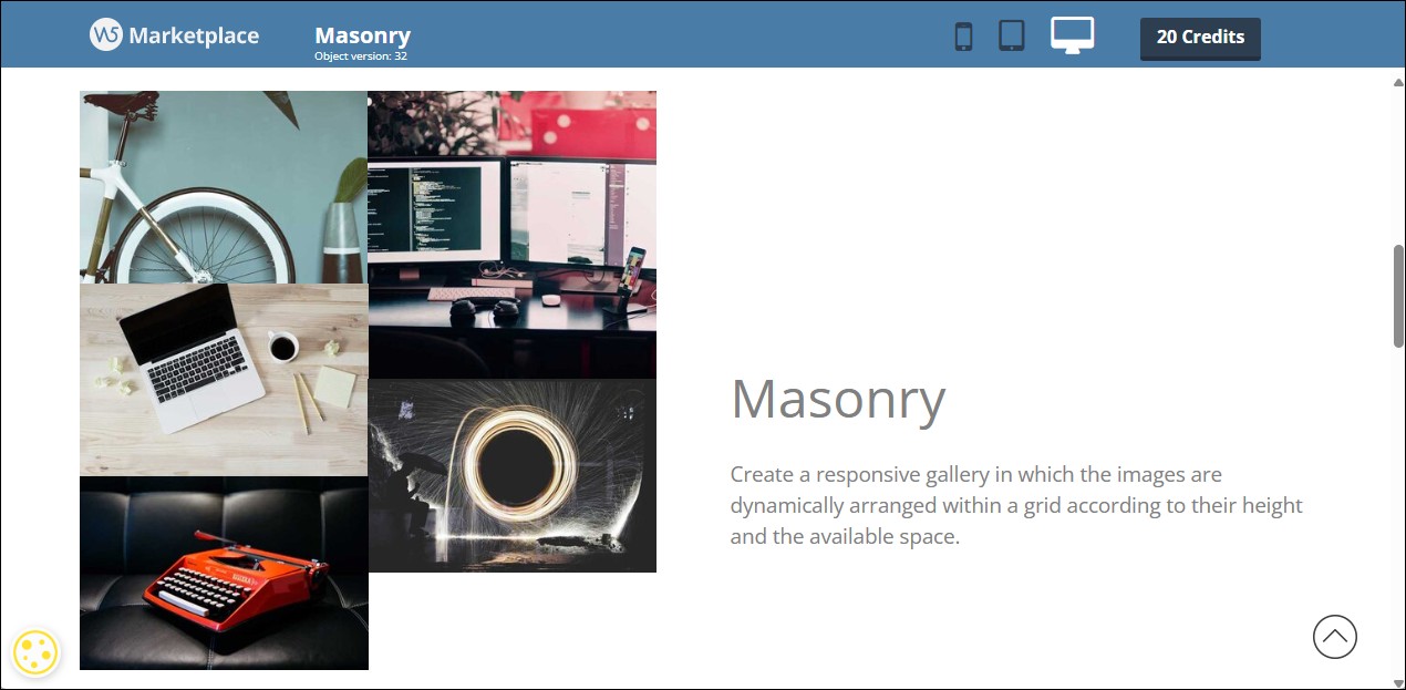
The Masonry Object was created precisely to address this need: it allows you to create dynamic grids in which elements are automatically arranged based on the available space and their height, resulting in fluid and visually balanced compositions. You can get a preview of what can be achieved on the Preview page.
How the Masonry layout works
The Masonry layout organizes elements within the page into columns, distributing them vertically based on the available space. Unlike a traditional grid, elements are not aligned on fixed rows: each item occupies the space it needs in height and is positioned in the first available spot in the column.
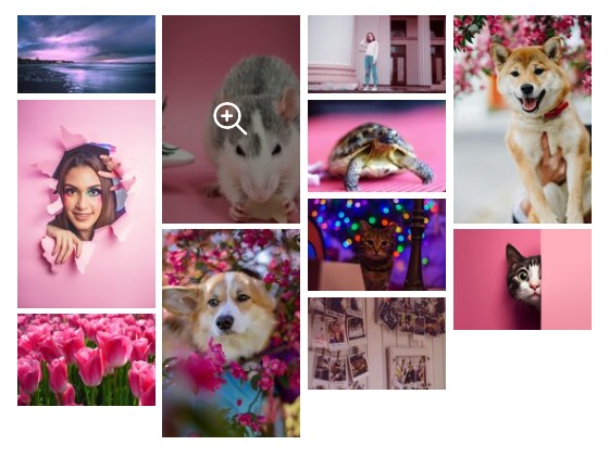
This mechanism makes it possible to naturally manage images or content with different proportions, avoiding empty spaces and maintaining a compact and visually balanced composition. The order of the elements is preserved, but their arrangement dynamically adapts to the size of the individual items and to the available width of the page.
The result is a fluid layout that makes better use of space and automatically adapts to size variations, without requiring manual intervention in the layout.
When to use the Masonry Object
As mentioned above, the Masonry Object is particularly suitable when working with heterogeneous visual content and when it is not necessary to maintain a rigid alignment on horizontal rows.
In general, it is recommended to use it when:
- images or content have different proportions and heights;
- the goal is to achieve a fluid and visually dynamic composition;
- the reading order is not strictly sequential.
On the other hand, it may be preferable to choose other objects when:
- it is necessary to maintain a precise alignment between elements;
- content needs to be compared row by row;
- the page structure requires a clear and predictable reading flow.
How to insert a Masonry Object
To use the Masonry Object, simply insert it into a page and access its settings to add and organize the content to be displayed.
- Double-click on the inserted Masonry Object to open the window with all available options.
- Click the Add button to import images. By clicking the arrow next to the Add button, you can choose whether to browse for
 Local files or use the
  Online Library (for more information, see How do you import a file?). The imported files make up the list of items, which you can freely reorder and edit.
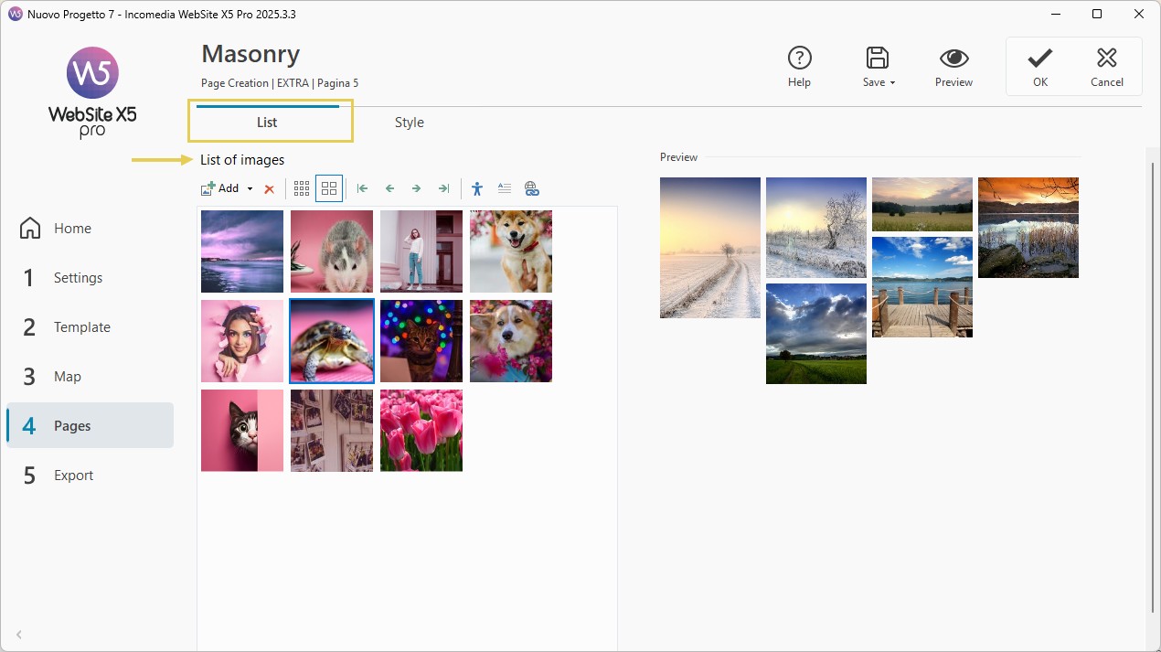
#tip – Multiple selection. Hold down the CTRL key and click all the files you want to select to import them in a single step.
- Using the buttons

 you can choose whether image previews in the list are displayed in small or medium size, making it easier to work.
 - Once the image list has been created, you can edit it at any time: in addition to adding new images, you can delete those you no longer need or move them to create a new order. To do this, simply select an image from the list and click the
 button to remove it or use the arrow buttons to move it.
 - Similarly, for each image you can:
- use the
 button to enter a title and alternative text useful for accessibility and SEO optimization (see Image accessibility: the importance of alternative text);
 - click the
 button and, in the dialog box that opens, enter a short text (for example, a title or caption);
 - click the
 button and set a link by choosing the most appropriate action.
- use the
How to define the style of the Masonry gallery
Now that you have created the gallery, you can focus on the more graphical aspects.
- Go to the Style section, set the Number of columns used to arrange the images, and define the behavior in Responsive mode: you can choose to reduce the number of columns as the available space decreases, in favor of larger images, or alternatively keep the number of columns always the same.
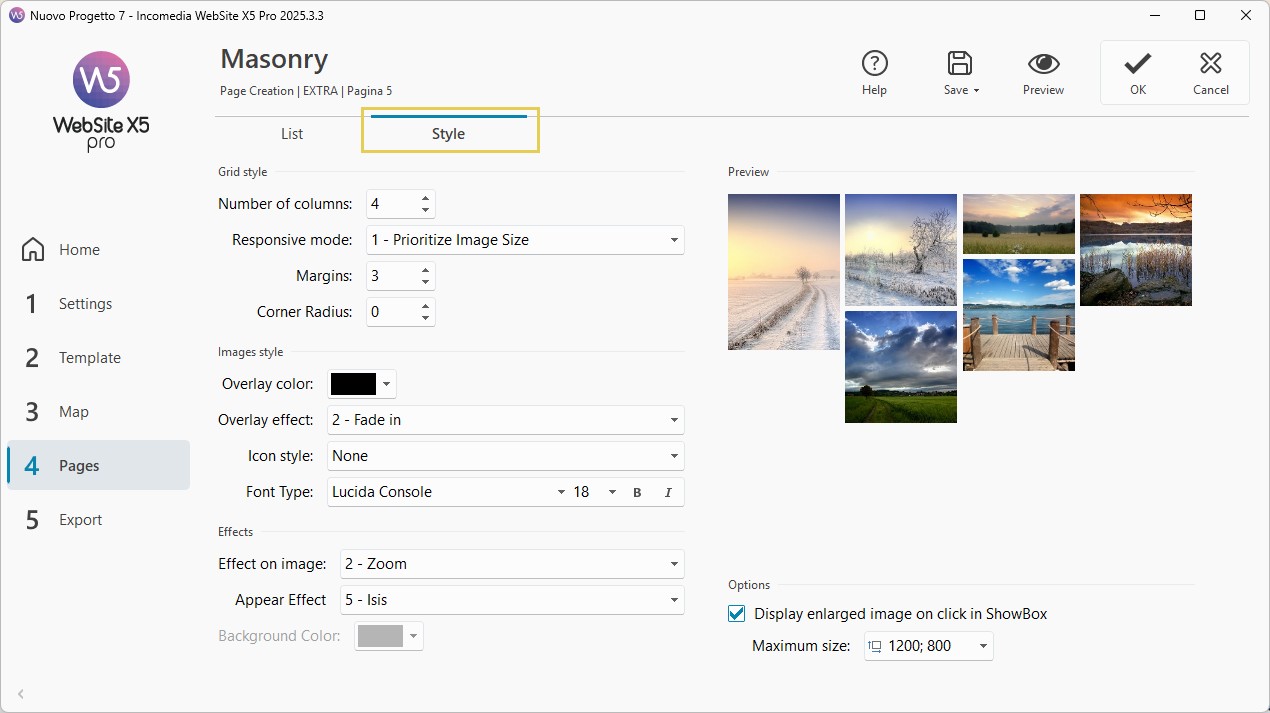
- To define the style of the grid, you can also adjust the Margins and apply a Corner rounding factor to round the corners of the images.
- Now configure the Image style: you can set a Color and an Overlay effect, as well as choose the icon that is displayed on mouse hover to indicate that the image can be clicked to open the enlarged view.
- You can also choose the Effects: both the one applied when hovering over a single image and the one used for the gallery’s appearance on the page.
- Finally, decide whether clicking on an image should display an enlarged version of the same image; if so, you can set the maximum size for the enlargement.
Practical tips for a good result
To achieve an effective and visually pleasing Masonry layout, keep a few best practices in mind when preparing your content and composing the page.
In particular:
- use a balanced number of elements, avoiding overly dense collections;
- maintain visual consistency among the images, especially in terms of style and quality;
- optimize the file size to improve page loading times;
- always check the result in preview, both on desktop and on mobile devices.
Can’t wait to use it on your website pages? Install the Masonry Object now
Don’t have enough Credits to purchase this Object? View all Credit packages