Compatibility:
WebSite X5 Evo and Pro
When a visitor scrolls down a page, the website Header - often containing the logo, main menu, and key links - is no longer visible. This can make it less immediate to navigate through the content, especially on more complex websites.
To improve navigation, accessibility, and user experience, WebSite X5 allows you to use a Sticky Bar, i.e. a top bar that remains visible while scrolling, keeping the main site elements always within reach.
The Sticky Bar is therefore a particularly useful tool to strengthen navigation, improve usability, and make the browsing experience more effective on both desktop and mobile devices.
Why use a Sticky Bar
A well-designed Sticky Bar allows you to:
- keep the main menu always accessible;
- improve user orientation;
- facilitate quick access to the most important sections;
- highlight the logo, CTAs, and key links;
- improve navigation on mobile devices.
How to enable and configure the Sticky Bar
1. Access the settings
- Go to Step 2 - Template Settings
- Click on Sticky Bar.
2. Enable the bar
- In the General section, enable the option Show a top bar.
3. Define the visual appearance
- Use the available options to define the background color or image, so you can give the bar the desired look.
- If you want the Sticky Bar to span the entire width of the browser window and not just the page content width, enable the option Extend to the width of the Browser window.
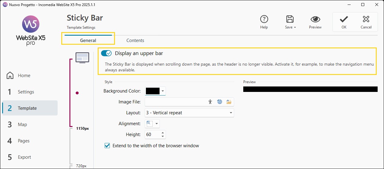
#tip - Accessibility. To make your pages accessible, consider providing alternative text content for the images used in the Sticky Bar. You can add ALT text by clicking thebutton available in the field where you import the file. For more information, see Image accessibility: the importance of alternative text.
How to define the contents of the Sticky Bar
Once you have defined the visual appearance, you need to take care of the Sticky Bar contents:
- Go to the Contents section of the Sticky Bar window.
Here you will find a graphical editor similar to the Template one (in the Template Content window). This editor includes a Toolbar and, below it, a workspace where the image used as background is automatically displayed at a 1:1 scale. All the changes you make are shown in real time on this image.
- Select from the list of available Objects those you want to use to build the Sticky Bar and drag them into the workspace.
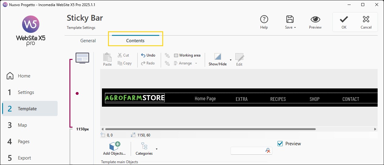
- Use the selection handles or the Toolbar commands to adjust the position, size, and alignment of the Objects.
- Double-click on an inserted Object to access its settings window.
#tip - Inside the Sticky Bar, it is advisable to include the main elements found in the Header, first and foremost the company logo or site title and the navigation menu. To speed up the process, you can select multiple Objects from the Template Header, copy them, and paste them directly into the Sticky Bar 'Contents' section.
How to optimize the Sticky Bar for a responsive website
If you are working on creating a responsive website (you have enabled the Responsive Website option in Step 2 - Template Settings > Resolutions and Responsive Design), in the sections where you define the Sticky Bar’s design and contents you have access to the Responsive Bar, which shows all the set breakpoints and, based on these, identifies different ranges.
To manage the display of the Sticky Bar, for each breakpoint proceed as follows:
1. Configure the Desktop version
- On the Responsive Bar, select the Desktop range.
- Define both the visual appearance and the contents of the Sticky Bar by following the steps described in the previous paragraph.
2. Check the subsequent breakpoints
- Select each range on the Responsive Bar in progressive order.
- The available space decreases: evaluate whether it is still possible to keep all Objects.
3. Manage hidden Objects
- Hide secondary elements in smaller views, keeping only the essential elements visible.
- To hide an Object, select it and click the
 Hidden Objects management button: you can choose to hide the Object only in the current view or also in all lower views.
 - To make a previously hidden Object visible again, select the desired range on the Responsive Bar, click the
 button and select the command Hidden Objects management for this view: from the list of hidden Objects, select the one you want and click to make it visible again.
#tip - For more information, see Responsive Template. How to adapt the site layout to different devices?
Practical tips for an effective Sticky Bar
Designing a Sticky Bar correctly means balancing accessibility, functionality, and visual clarity.
To achieve the best results:
- include only essential content;
- prioritize menus, logo, and strategic CTAs;
- avoid overly tall bars;
- check readability on smaller screens;
- use the Responsive Bar to optimize each breakpoint;
- hide secondary content on mobile;
- always test behavior using the local Preview;
- make sure buttons and links are easy to click.
In summary
The Sticky Bar is an extremely useful tool for improving navigation, accessibility, and continuity in site usage.
With WebSite X5, you can configure it visually, customizing its design, contents, and responsive behavior without writing any code.
If used correctly, the Sticky Bar helps create more professional, user-friendly, and effective websites, offering users a smoother and more immediate navigation experience on any device.