Compatibility:
WebSite X5 Pro
When creating a particularly complex Responsive Website, it may be necessary to intervene not only on the order of the content or its visibility, but also on its structural arrangement across different breakpoints.
With WebSite X5 Pro, in addition to defining the order of Objects and choosing which content to show or hide, you can use Row Breaks to control the layout of pages more precisely at lower resolutions.
What are Row Breaks
A Row Break allows you to force one or more Objects, or entire Blocks of Objects, to move to a new row when the site switches to lower breakpoints.
In practice, it is a controlled “line break” that allows you to:
- improve readability;
- avoid overly compressed layouts;
- better distribute content;
- create a more organized responsive structure;
- further customize the arrangement of elements.
This tool is particularly useful when the automatic layout does not produce the desired result.
How to set Row Breaks
To insert a Row Break:
1. Access Responsive Settings
- Go to Step 4 - Pages.
- Open the desired page.
- Click on the Responsive button to open the Responsive Settings window.
2. Enable Row Break mode
- Click on the Row Breaks button.
- In the Grid, grey dashed lines appear where a new break can be inserted.
3. Insert or remove breaks
- Click on a grey dashed line to insert a break (it turns red).
- Click again on a red line to remove it.
4. Confirm
- Click again on the Row Break button to save and exit the mode.
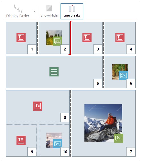
Image 1. The Grid in Row Break mode
How they work across breakpoints
Row Breaks do not modify the layout of the currently selected breakpoint, but determine how the page will be reorganized in the immediately following breakpoint.
This means that:
- the order of Objects remains unchanged;
- hidden Objects remain excluded;
- the layout is redefined based on the inserted breaks.
Practical example
To better understand how it works, consider the example image where, at the Desktop breakpoint, Row Breaks have been set before Object 3 and after Object 7:
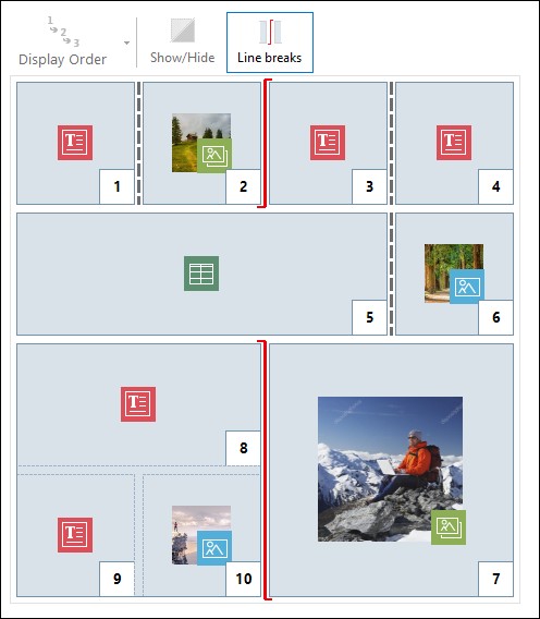
Image 2. Structure for the Desktop breakpoint
Note that the Row Break symbol reflects the defined ordering. This helps clarify, for example, that Object 7 will be positioned above the Block of Objects 8, 9, and 10, since the ordering for that row goes from right to left.
Given the defined ordering, the inserted Row Breaks, and considering that Object 2 has been set as not visible, the Page structure at the breakpoint immediately following the Desktop one will appear as follows:
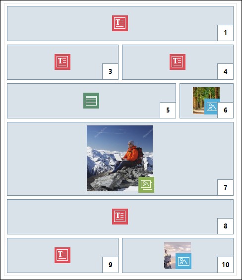
Image 3. Structure for the breakpoint following the Desktop one
As you can see, Object 2, which was set as not visible, is no longer present, but this does not affect the ordering of the Objects, which remains unchanged. The Row Break forces Objects 3 and 4 to be placed on row 2 of the Grid, allowing Object 1 to fully occupy row 1. Without the Row Break, Objects 1, 3, and 4 would have remained side by side on row 1, each occupying one third of the available width.
Similarly, the second Row Break causes Objects 8, 9, and 10 to no longer be part of a single Block and to be arranged on new rows below Object 7.
Managing proportions
When an Object spans multiple columns, WebSite X5 automatically maintains its width proportion in subsequent breakpoints.
Taking the page configuration in Image 1 as an example, at the Desktop breakpoint, Object 5 occupies 3 out of 4 available columns: this means it takes up 75% of the row width. This proportion is maintained in the next breakpoint (Image 3), even though the other Objects aligned horizontally no longer follow the previous arrangement.
This helps preserve visual balance even when the layout changes.
Practical tips
To use Row Breaks effectively:
- use them to simplify complex layouts;
- avoid excessive fragmentation;
- always check the result in subsequent breakpoints;
- consider the combined effect with hidden Objects;
- check the local Preview after each change.
In summary
Row Breaks are an advanced but very useful tool to refine the responsive behavior of pages.
With WebSite X5 Pro, you can visually manage even the most detailed aspects of content layout, improving structure, readability, and control without manually editing code.
When used correctly, Row Breaks allow you to create more organized, professional, and effective responsive pages on any device.