Compatibility:
WebSite X5 Evo and Pro
When creating a Responsive Website, properly configuring breakpoints, layout, and content is only part of the work. Before publishing online, it is essential to verify that all pages actually adapt as expected to different resolutions.
WebSite X5 provides Local Preview tools that allow you to simulate the responsive behavior of the site, check the arrangement of Objects, and quickly identify any layout issues before going online.
Why check the site in Preview
Responsive Preview allows you to:
- check how the layout behaves across different breakpoints;
- verify readability and usability;
- test content arrangement;
- identify ordering or visibility issues;
- optimize the user experience before publishing.
This step is essential to ensure a professional result on desktop, tablet, and smartphone.
How to check a Responsive Website in WebSite X5
1. Start the Local Preview
- Go to Step 4 - Pages.
- Open the page you want to check.
- Click the Preview button to open the internal browser.
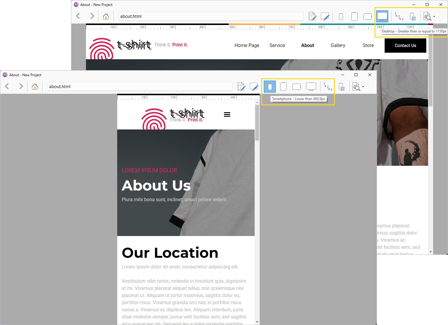
2. Use the Resolution Bar
- In the internal browser, you will find a bar that displays all active breakpoints using different colors.
- Click the buttons


 corresponding to the different breakpoints: the browser window will automatically resize to the selected resolution so you can check how the page is displayed.
 - Alternatively, manually resize the browser window to observe how the layout behaves dynamically.
3. Test the site on mobile devices (Pro only)
- If you are using WebSite X5 Pro, click the
 Mobile Preview button.
 - A QR Code and a dedicated URL will be generated.
- Connect your smartphone or tablet to the same network as your PC, scan the QR Code or open the provided URL. This allows you to preview your site directly on your device and check how it behaves during mobile navigation.
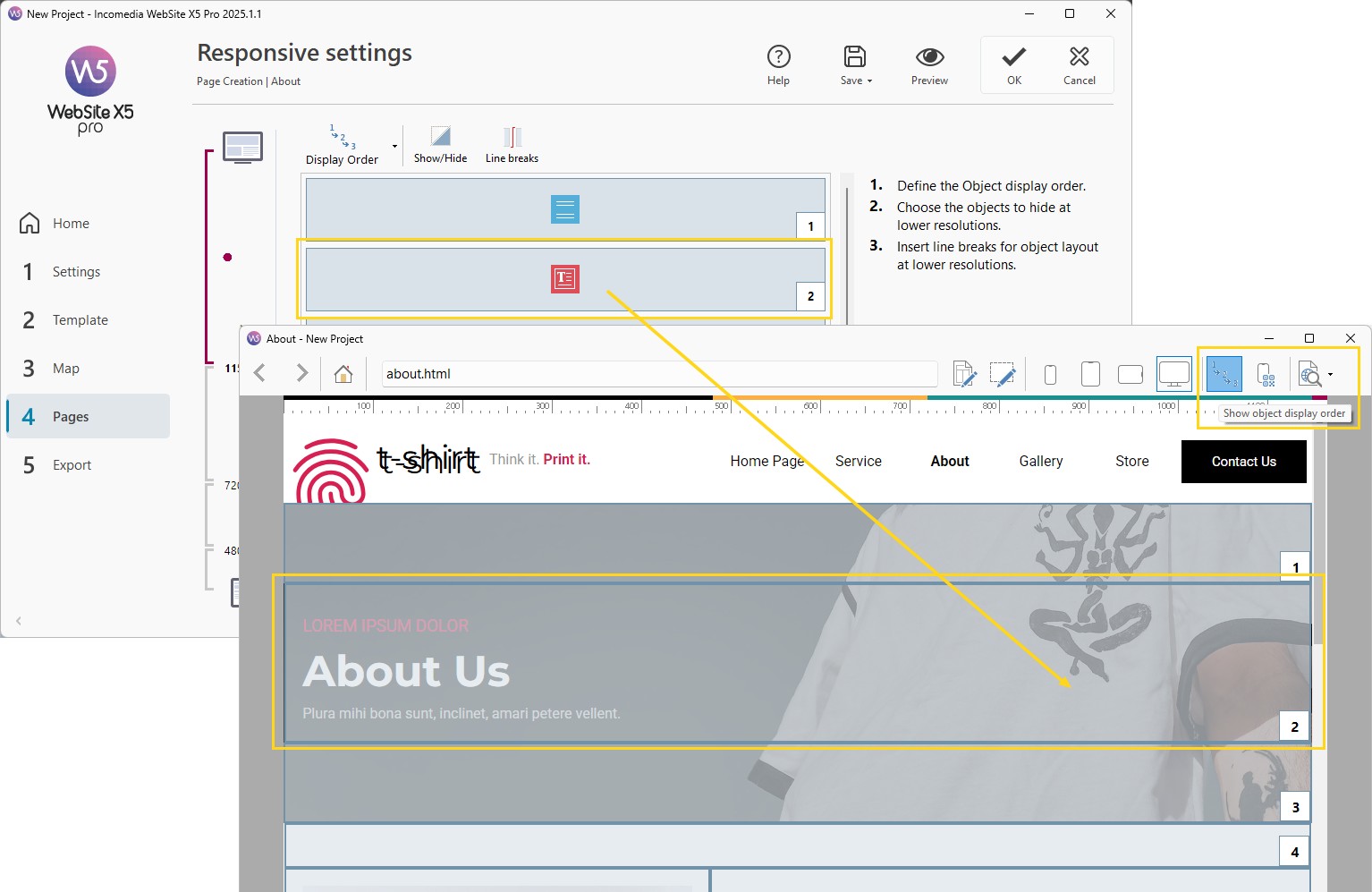
4. Check content ordering
- If, in the Preview, some contents are not arranged as expected, click the
 Show numbering button.
 - Each content will be highlighted with the number associated with its Object in the responsive ordering process.
- This will help you understand what needs to be adjusted to achieve the desired result.
Practical tips
To perform more effective checks:
- check all the pages of your website;
- verify every active breakpoint;
- test both desktop and mobile;
- use numbering to fix ordering issues;
- repeat the check after every major change.
In summary
The local Preview is an essential tool for verifying the responsive quality of your project before publishing.
With WebSite X5, you can visually check layout, content, and page behavior at any resolution, reducing errors and improving the final user experience.
A thorough check allows you to publish more professional, reliable, and effective websites on any device.