Compatibility:
WebSite X5 Evo and Pro
In Responsive Web Design, designing a page correctly does not only mean choosing which content to publish, but also determining how that content should adapt to different devices.
The same content can play a different role depending on whether it is viewed on a desktop or a smartphone: on large screens, visual elements can be emphasized, while on mobile devices, speed of access, readability, and immediate access to essential information often become priorities.
For this reason, a good responsive strategy requires organizing content intelligently, defining priorities, display order, and actual presence across different breakpoints.
Why it is important to plan responsive content
When designing a responsive page, you should ask yourself:
- which content is truly essential;
- which can be reduced or hidden on mobile;
- which display order is most effective;
- how to optimize the user experience across different devices.
The goal is always to present the most useful content in the most effective way possible.
A practical strategy
A good strategy is to create a list of all the content that should be included on a Page and order it from the most important to the least important: this makes it easier to identify essential content that must always remain available, and secondary content that can instead be hidden when, at lower resolutions, only what is truly necessary needs to be shown. Of course, this sorting process should be repeated for each Page of the Website.
Practical example
To better understand this mechanism, let’s take the example of a restaurant website. When the site is viewed on desktop, you can focus heavily on images and animations that showcase the dishes on the menu to attract and entice users. However, when the same site is viewed on mobile, it can be assumed that the user is more interested in reading reviews or finding contact information rather than viewing large images. It therefore becomes necessary to reduce the use of images to meet the needs of a user who is operating with a less capable device (small screen, not necessarily fast connection, etc.) and who, while on the move, needs quick and precise information.
How to manage responsive content in WebSite X5
In WebSite X5, once you have created the page as it should appear on desktop, you can define how it should change based on the different activated breakpoints.
1. Create the Desktop page
- Go to Step 4 - Pages.
- Create the Page by dragging the necessary Objects into the layout Grid and inserting the various contents. The Page created this way is the one that will be displayed for resolutions above the Desktop breakpoint.
2. Open Responsive Settings
- Click the
 Responsive button.
 - In the Responsive Settings window, the Responsive Bar shows all the Views determined by the breakpoints activated for the Site.
3. Manage Object ordering
- Proceed in order: start by selecting the Desktop View on the Responsive Bar.
- The Grid displays the configuration set in the Page Creation window.
- Click the
 Order button to activate the mode that allows you to reorder the Objects in the Grid. Each Object is assigned a number based on the automatic ordering set by the program.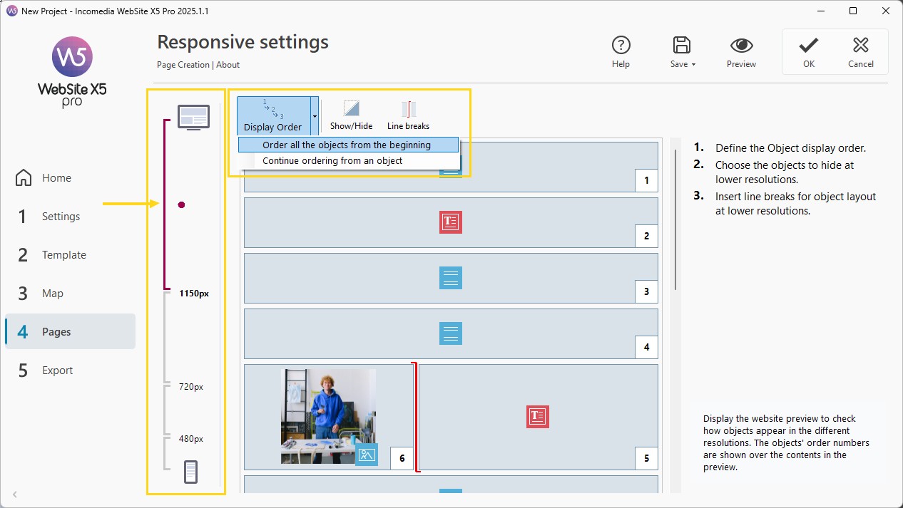
- Change the order of the Objects based on their importance and how you want them arranged on the Page. You can:
- Use Order > Reorder all Objects from the beginning, then click first on the Object you want to place first and continue selecting all others in order.
- Use Order > Continue ordering from an Object, click on the Object from which you want to continue ordering. All previous Objects are confirmed, while you define the position of the following ones.
The ordering process is guided: once an Object is selected, all Objects you can click next are highlighted with a red border. The order set for the Desktop View will also be applied to all other Views.
- The ordering process ends:
- when you click on the last Object on the Page;
- if you click Order > Complete ordering: the current order is confirmed;
- if you click Order > Cancel ordering: changes are discarded and the initial order is restored.
#tip - For more information, see Responsive Object Ordering. How to correctly organize content in different views?
4. Show/Hide content
- Click the
 Show/Hide Object button to set Objects as invisible.
 - Click the Objects that should no longer be visible at lower resolutions than the currently selected one.
- Click the button again to confirm and exit the mode.
5. Manage Line Breaks
- Click the
 Line Break button to force some Objects to wrap to a new line at lower resolutions.
 - Gray dashed lines indicate where line breaks can be inserted: click them to set the desired breaks.
- Click the button again to confirm and exit the mode.
#tip - For more information, see Responsive Settings. How to create more flexible layouts with Line Breaks?
6. Manage intermediate views
When using the Pro edition, you can set up to 10 breakpoints: this requires managing content also at intermediate resolutions.
- Use the Responsive Bar to select the View following Desktop.
- The Grid updates based on the Desktop configuration: adjust it by hiding Objects or adding line breaks if needed.
- Repeat for all subsequent Views.
7. Manage Smartphone view
At the Smartphone View, nothing more is required: all visible Objects are automatically linearized, meaning they are displayed one below the other based on the defined order.
#tip - The Grid shows the structure for the selected resolution range. Changes you make define how the Page will appear in the next lower resolution range.
Pay attention to empty cells
When creating a new Page in a responsive Website, make sure there are no empty Cells in the layout Grid. The program treats empty Cells as if they were (empty) Objects and assigns each of them a position in the ordering: these positions cannot be changed and will affect the ordering possibilities of the real Objects. To maintain maximum flexibility when ordering Objects, it is therefore better to avoid empty Cells and instead insert empty Objects: if added manually, these empty Objects will not affect the Page composition and can be reordered.
Practical tips
To achieve better results:
- always plan content by priority;
- start from the Desktop version;
- simplify progressively;
- test all views;
- prioritize speed and readability on mobile;
- always check the result in Preview.
In summary
Properly managing responsive content means designing pages that can adapt not only in structure, but also in the relevance and usability of their content.
With WebSite X5 you can control the order, visibility, and layout of Objects without working on the code, creating a more effective, modern, and optimized user experience for every device.