Compatibility:
WebSite X5 Evo and Pro
When creating a responsive website, it is not enough to adapt only the page content: the Template must also be optimized to ensure effective display on desktop, tablet, and smartphone.
As the available resolution decreases, some layout elements may no longer have enough space or may become less useful for navigation. In these cases, it is important to adjust the Template to simplify the structure, improve readability, and maintain a good user experience.
With WebSite X5, you can manage these changes easily and visually, defining how the structure, Header, and Footer automatically adapt to the configured breakpoints.
Why it is important to adapt the Template
The Template represents the overall structure of the website and includes fundamental elements such as:
- page layout;
- Header;
- Footer;
- menu;
- fixed project areas.
Properly managing the responsive Template allows you to:
- improve navigation;
- simplify the interface on smaller screens;
- hide non-essential elements;
- optimize spacing and proportions;
- maintain visual consistency.
How to modify the Template Structure for each breakpoint
In WebSite X5, you can work on the Template to define how it should change across the different views determined by the breakpoints you have enabled:
1. Access the Template Structure
- Go to Step 2 - Template.
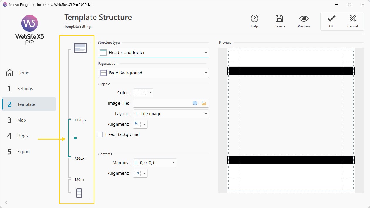
- Open the Template Structure window: if you have chosen to create a responsive website, the Responsive Bar will appear on the side of the window.
- The Responsive Bar displays all the intervals defined by the breakpoints you set in the Resolutions and Responsive Design window: use it to select the view you want to work on.
2. Configure the Desktop view
Always start from the main view:
- Select the Desktop view on the Responsive Bar.
- Use the available options to set the base structure of the Template.
3. Customize lower views
Then proceed breakpoint by breakpoint:
- Select each interval on the Responsive Bar.
- Use the available options to modify the layout, remove unnecessary elements, and adapt the structure to the available space.
#tip - For more information on how to build and customize a Template, see How do you create a new Template starting from a Blank Template?
#tip - Default Templates. All default Templates included in WebSite X5 are already responsive. Each Template has a predefined set of breakpoints that becomes active when the Responsive Website option is enabled in the Resolutions and Responsive Design window. You can, of course, modify this predefined set of breakpoints according to your needs.
How to adapt Header and Footer
In addition to the Template, the Header and Footer may also require specific adjustments for each view.
To manage them, proceed as follows:
1. Access the Template Content
- Go to Step 2 - Template.
- Open the Template Content section.
- In this window as well, since you are working on a responsive website, the Responsive Bar is available.
2. Use the Responsive Bar
- On the Responsive Bar, select the interval corresponding to the Desktop view and use the available options to build the Template Header/Footer.
- Still on the Responsive Bar, select each of the other intervals in sequence and make the necessary changes.
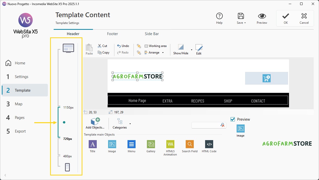
- For each breakpoint, you can:
- add new Objects;
- hide Objects;
- restore hidden elements;
- modify position and size;
- adapt the overall layout.
Managing Objects in different views
Adding Objects
An added Object will be:
- visible in the current view;
- visible in lower views;
- hidden in higher views.
Hiding Objects
- Select an Object and click the
 Show/Hide Object.
 - You can choose whether to:
- hide it only in the current view;
- hide it also in lower views.
Restoring hidden Objects
- Click the small triangle on the
 Show/Hide Object.
 - In the menu, click Hidden Objects Management.
- In the window that opens, select the previously hidden Object and enable the Visible option.
Repositioning Objects
In the different views you can modify:
- position;
- size.
All other Object properties remain unchanged across the different views.
#tip - For more information, see How do you modify the composition of Header and Footer?
#tip - Automatic repositioning. If in a given view one or more Objects are positioned in such a way that they are no longer fully visible, they are automatically repositioned. During this repositioning, Objects are moved but not resized: this may result in overlapping Objects. For this reason, it is recommended to always check how Header and Footer behave across different breakpoints using Preview.
Practical tips
Here are some useful tips to achieve better results:
- always start from the Desktop layout;
- simplify progressively;
- check Header and Footer separately;
- hide only what is truly unnecessary;
- verify every change in Preview;
- pay attention to possible overlaps.
In summary
Properly adapting the Template of a responsive website means building a flexible structure capable of maintaining visual quality, clarity, and functionality on any device.
With WebSite X5, you can manage all of this without working on code, using visual tools that simplify layout customization and allow you to optimize the user experience in every view.
Your task is to organize the structure strategically, making adjustments where necessary to ensure an effective and professional experience on every device.