Compatibility:
WebSite X5 Evo and Pro
When designing a responsive website, one of the most important aspects to define is breakpoints. These control points allow the layout to adapt correctly to different devices, ensuring effective navigation on desktop, tablet, and smartphone.
Setting breakpoints correctly means organizing the site so that structure, content, and readability can change at the right moments, offering users a consistent experience regardless of screen size.
What is a breakpoint
A breakpoint is a specific point in the range of screen resolutions where the website layout changes to better adapt to the available space.
In practice, each breakpoint defines the transition from one view to another.
For example, the following image represents the behavior of a website for which 3 breakpoints have been set: at 960px, 720px, and 480px.

With 3 breakpoints, 4 different views are defined. In this way:
- above 960px the site can maintain a desktop structure;
- between 720px and 960px, the layout can adapt to landscape tablets;
- between 480px and 720px, the layout can adapt to portrait tablets;
- below 480px, the content is optimized for smartphones.
Why breakpoints are important
Breakpoints allow you to:
- adapt the layout to different device categories;
- improve readability and usability;
- avoid disorganized layouts;
- optimize images, text, and menus;
- provide a more professional responsive experience.
The goal is not to create a configuration for every single device, but to identify effective macro display categories.
Reference breakpoints in WebSite X5
The most common practice is to set breakpoints based on the screen sizes of the main types of devices. Following this approach, WebSite X5 shows the following breakpoints on the Reference Resolutions line:
- 960px: Desktop
- 720px: Tablet in landscape orientation
- 600px: Tablet in portrait orientation
- 480px: Smartphone in landscape orientation
- Below 480px: Smartphone in portrait orientation
These values represent a starting point, but they can be adjusted according to the specific needs of your project.
How many breakpoints should you use?
There is no definitive answer to this question. The choice depends on:
- site structure;
- layout complexity;
- type of content;
- target audience;
- desired level of customization.
In general:
- WebSite X5 Evo allows the management of 3 breakpoints;
- WebSite X5 Pro allows you to configure up to 10.
The more complex the layout, the greater the need for additional breakpoints may be.
How to set breakpoints in WebSite X5
After considering how many and which breakpoints to enable, you can configure them in WebSite X5 as follows:
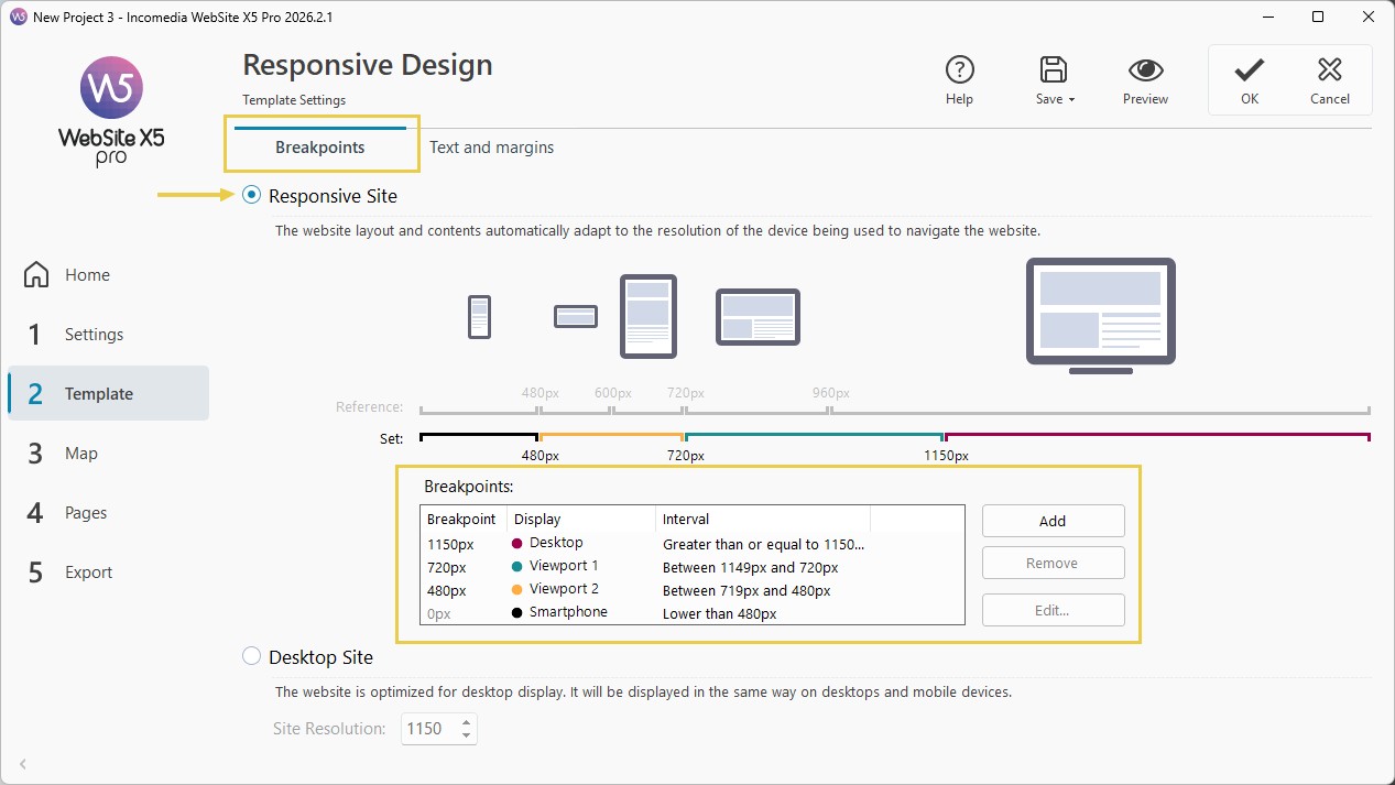
1. Enable Responsive Design
- Go to Step 2 - Template.
- Open the Resolutions and Responsive Design window.
- Stay in the Breakpoints section.
- Enable the Responsive Website option.
2. Define breakpoints
- Stay in the Breakpoints section and define the list of breakpoints to activate for the website using the Add, Remove, and Editcommands. You can:
- modify existing breakpoints;
- add new breakpoints (Pro);
- remove intermediate breakpoints (Pro);
- customize adaptation thresholds.
- All configured breakpoints are listed in the summary table and will be used in the Responsive Settings window.
3. Consider management rules
When setting breakpoints, keep in mind that:
- By default, all breakpoints are set according to values taken from the graphic template selected for the project.
- All breakpoints can be modified using the Edit button, except for the Smartphone breakpoint, which automatically inherits the value of the higher breakpoint.
- In the Evo edition, it is not possible to delete existing breakpoints or add new ones.
- In the Pro edition, it is not possible to remove the Smartphone breakpoint, but you can remove intermediate breakpoints (using the Remove button). The Desktop breakpoint can be selected and removed, but the next breakpoint is automatically set as the new Desktop breakpoint. At least 2 breakpoints must always be present: Smartphone and Desktop.
- In the Pro edition, you can add new breakpoints (using the Add button) up to a maximum of 10, including the Desktop and Smartphone breakpoints.
- The Smartphone breakpoint defines the minimum resolution below which the website is always displayed in a linear layout: all Objects are shown one below the other (respecting the order and visibility settings defined in the Responsive Settings window) and, like the page width, are set to occupy 100% of the available width.
#tip - While in the Evo edition you only need to define the Smartphone breakpoint, in the Pro edition you can set up to 10 breakpoints, including Desktop and Smartphone. If you open a project created with the Evo edition in the Pro edition, the Smartphone breakpoint is retained and you can add new ones.
Practical tips
To achieve an effective configuration, keep these practical tips in mind:
- avoid unnecessarily excessive breakpoints;
- test the layout on multiple devices;
- prioritize simplicity and readability;
- consider the actual behavior of the content;
- always check the final result in Preview.
In summary
Breakpoints represent the technical foundation for building an effective responsive website.
With WebSite X5, you can manage them without directly working on code, using visual tools that simplify configuration, adaptation, and control of different views.
Your goal is to identify the most suitable transition points for your project, ensuring an optimal browsing experience on any device.