Compatibility:
WebSite X5 Evo and Pro
When designing a website, you often define text sizes and spacing with desktop viewing in mind. However, these same settings may not work well on smaller screens: titles may appear too large, text may wrap in an unbalanced way, and there may be excessive space between elements.
To solve these issues, WebSite X5 provides a system that automatically optimizes text and margins across responsive views, improving readability and visual balance without requiring manual adjustments for each element.
How automatic optimization works
By enabling this feature, WebSite X5 automatically adjusts some key aspects of the layout:
- text size: fonts are progressively reduced from desktop to smaller resolutions;
- line spacing: it automatically adapts proportionally to the text size, maintaining good readability;
- margins: they follow the same proportional reduction logic to adapt to the available space.
It is important to note that the reduction is not applied uniformly to all elements, but follows a proportional logic: larger texts are reduced more than smaller ones. This helps preserve the visual hierarchy between titles, subtitles, and paragraphs even at lower resolutions, preventing all text from being flattened to the same size.
In this way, the website not only adapts its layout, but also maintains consistent proportions and readability across all devices.
How to enable text and margin optimization
To configure this feature:
1. Access the Responsive settings
- Go to Step 2 - Template.
- Open the Resolutions and Responsive Design window.
- Go to the Texts and margins section.
2. Enable the feature
- Select the option Enable automatic text and margin reduction: once enabled, the optimization will be applied to the entire website.
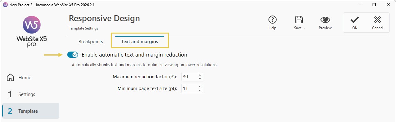
3. Customize the parameters
- You can adjust how the optimization works based on your design needs to find the right balance between visual impact and usability. In particular, you can control:
- Maximum reduction factor: defines how much texts and margins can be reduced at smaller resolutions. This value represents the theoretical maximum reduction limit, but it is not applied equally to all texts.
- Minimum text size: expressed in points (pt), defines the size below which the text cannot be reduced. If a text is already smaller than this value, it will not be modified. For example, by setting a minimum size of 12 pt, any text at 10 pt will remain unchanged.
The minimum size set is used as a reference to calculate the proportional reduction of texts: larger fonts are reduced more significantly, approaching the maximum factor set, while smaller ones undergo a more limited reduction.
This behavior prevents all texts from being standardized to the same minimum size at lower resolutions. In this way, the visual hierarchy between headings and content is preserved, improving readability and page structure.
Which elements it applies to
Automatic optimization affects the main elements of the website, including:
- template texts and typographic styles;
- page and section titles;
- textual content within Objects (Text, Blog, Products, etc.);
- margins and spacing of objects and sections.
This ensures consistent behavior across the entire project.
Practical tips
To achieve better results:
- always enable optimization in responsive projects;
- check the preview on multiple devices;
- avoid overly aggressive reduction factors;
- set an appropriate minimum text size;
- carefully review complex titles and sections.
In summary
Automatic text and margin optimization is a key tool for quickly improving the responsive quality of a website.
With WebSite X5, you can rely on the software to handle much of the typographic and structural adaptation, while still maintaining control over the main parameters without needing to manually adjust every single element.
When used correctly, it helps improve readability, visual harmony, and user experience on any device.