Compatibility:
WebSite X5 Evo and Pro
In Responsive Web Design, designing a page correctly does not only mean choosing which contents to publish, but also defining how these contents should adapt to different devices.
On a wide screen, you can place several elements side by side, while in narrower Views it may be necessary to change their arrangement, define a different reading order, or hide less important contents.
With WebSite X5, you can manage these aspects through the Responsive Settings, adjusting the order, visibility, and arrangement of Objects at the different breakpoints.
Why it is important to plan responsive contents
When designing a responsive page, you should ask yourself:
- which contents should always be easily accessible;
- in which order they should be presented;
- which elements can eventually be hidden in narrower Views;
- how Objects should be arranged when there is no longer enough space to keep them side by side.
The goal is not simply to reduce contents on mobile devices, but to make sure the Page remains clear, readable, and functional at any resolution.
A practical strategy
Before working on the Responsive Settings, consider the contents on the Page and define which sequence makes them easiest to understand and use effectively.
Identify the essential elements, evaluate the relationships between texts, images, and other Objects, and consider which secondary contents can eventually be hidden at narrower resolutions.
This assessment should be made for each Page, because contents and priorities can vary in different parts of the Website.
Practical example
Imagine a restaurant Page where, in the Desktop View, images of dishes, descriptive texts, contact information, and booking buttons are arranged in multiple columns.
When the available space decreases, keeping the same arrangement can make the Page difficult to read. You can therefore define the order in which the different contents should be presented, make some Objects wrap onto the next row and, if necessary, hide less important elements at certain resolutions.
This way, the same contents can adapt to the available space while maintaining a clear and easy-to-browse structure.
How to manage responsive contents in WebSite X5
In WebSite X5, once you have created the page as it should be displayed on desktop, you can define which changes it should undergo according to the different active breakpoints.
1. Create the Desktop page
- Go to Step 4 - Pages.
- Open the Page you want to work on.
- Insert the necessary Objects into the Layout Grid and organize the contents as you want them to be displayed on Desktop.
This structure represents the starting point for defining the behavior of the Page at lower resolutions.
2. Open the Responsive Settings
- Click the
 Responsive.
 - In the Responsive Settings window, the Responsive Bar shows all the Views determined by the breakpoints activated for the Website.
- Select the Desktop View to start.
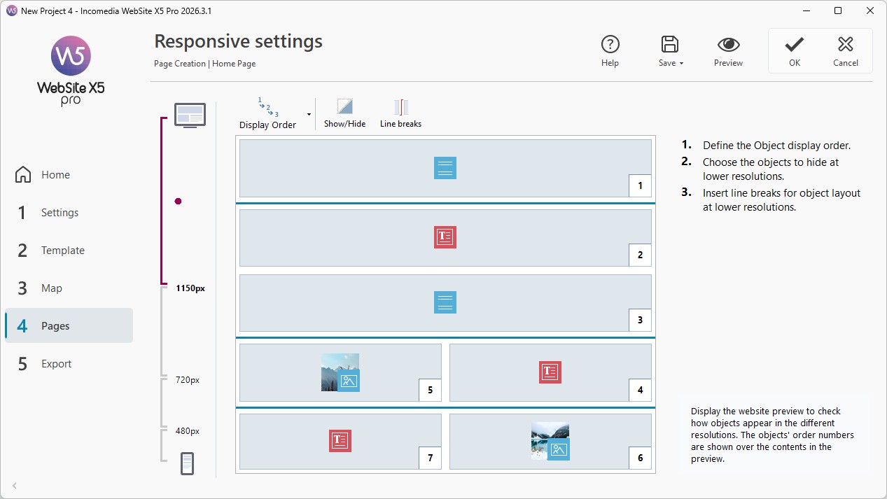
The Grid reproduces the Page structure and provides the commands needed to define how it should change in the subsequent Views.
3. Define the Object order
The order defines the sequence in which the Objects are reorganized when, as the available space decreases, they can no longer keep the layout set on Desktop.
- On the Responsive Bar, select the Desktop View.
- Click the
 Order.
 - Change the Object order according to the logical sequence of the contents and how you want them to be arranged on the Page.
- Continue ordering until you reach the last Object on the Page.
If the Page is organized into multiple Sections, WebSite X5 manages the ordering of the Objects in each Section separately. This makes it easier and faster to define the Object order, especially on more complex Pages..
#tip - For more information, see Responsive Object Ordering. How do you organize contents correctly in the different Views?
4. Choose which Objects to show or hide
Not all Objects necessarily need to be displayed at every resolution. If content becomes less useful or takes up too much space in a narrower View, you can choose not to display it.
To do this:
- On the Responsive Bar, select the View you want to start from.
- Click the
 Show/Hide Object.
 - Click the Objects you do not want to display at lower resolutions.
- Click the
 Show/Hide Object button again to confirm and exit the mode.
Hidden Objects will not be present in the subsequent Views, and the other contents will be rearranged in the available space.
Always proceed by considering the actual role of the contents: hiding an Object can be useful for simplifying the Page, but it should not make important information less accessible.
5. Use Row Breaks to control the layout
When multiple Objects are placed side by side, at a lower resolution you may want to define exactly where they should wrap onto the next row.
Row Breaks are designed precisely for this: they let you change the arrangement of the Objects in subsequent Views without changing their order.
To use this feature, available only in the Pro edition:
- Select the desired View.
- Click the
 Row Break.
 - A gray dashed line appears at every point where a Row Break can be inserted: click the dashed lines to set the desired Row Breaks.
- Click the
 Row Break button again to confirm and exit the mode.
#tip - Sections and Row Breaks perform different functions. Sections structurally organize the Layout Grid, while Row Breaks control how Objects wrap onto the next row in the different responsive Views. For more information, see Responsive Settings. How do you create more flexible layouts with Row Breaks?
6. Manage the intermediate Views
When working with the Pro edition, you can set up to 10 breakpoints in total. After setting the Desktop View, continue with the subsequent Views following the order shown in the Responsive Bar.
- Use the Responsive Bar to select the View following the Desktop View.
- The Grid is updated according to the settings defined for the Desktop View: based on this new configuration, proceed by setting other Objects as hidden, if necessary, and adding further row breaks.
- Repeat these steps for all the subsequent Views.
#tip - The Grid shows the structure assumed by the Page in the selected View. The changes you set determine instead how the Page will be organized in the immediately following View.
7. Manage the Smartphone View
When you reach the Smartphone View, no further settings are required.
The Objects that remain visible are fully linearized and arranged one below the other according to the order defined initially.
In any case, check the result to make sure that the content sequence remains understandable and that the most important information is easy to access.
Practical tips
To achieve a good responsive result:
- consider the logical order of the contents, not just their importance;
- start from the Desktop View and proceed in order toward the narrower ones;
- hide content only when it is not needed in the selected View;
- use Row Breaks to control the transition from a side-by-side layout to a multi-row layout;
- keep essential contents readable and easy to access even in the narrower Views;
- always check the result in Preview at the different breakpoints.